The Sompo Museum of Art marks its milestone 50th anniversary this year, and I was given the opportunity to design its anniversary logo.
A 50th anniversary is not simply a time for historical retrospective. It is an important turning point into the next 50 years. It is a chance to look deeply at the journey to date and from that, to discover the potential for greater value in the journey ahead.
As a designer and an art lover myself, I was thrilled to be entrusted with the Sompo Museum of Art’s commemorative logo. This was a source of joy for me and an experience that has left a deep impression.
Personal attachment and rigorous objectivity
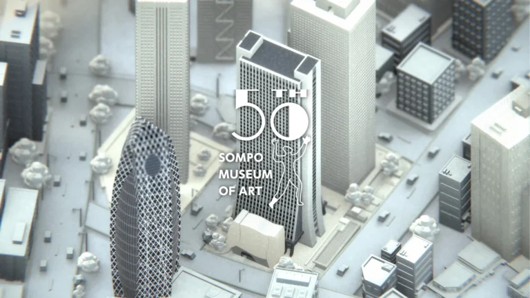
The Sompo Museum of Art is a special place for me; I have visited it many times since my student days. Amid the bustle of Shinjuku, it offers quiet and clarity, a calming of mind for appreciating its art. It is for me a peaceful sanctuary and a place to train and sharpen my sensibilities.
Precisely because of my strong personal attachment to the museum, I deliberately stepped back to a stance of “learning” before designing its anniversary logo. The logo would belong to the museum and be for the benefit of its visitors. I was keenly aware of the need for objectivity to prevent the logo’s design from appearing self indulgent.
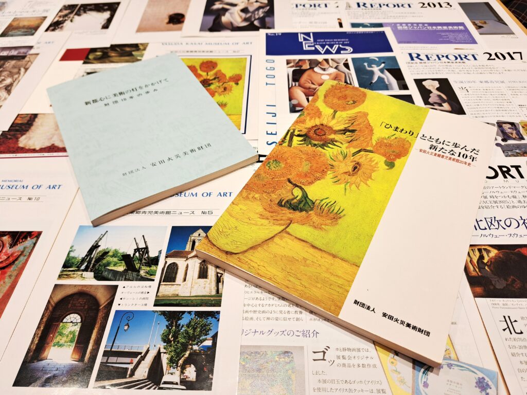
I explored the museum’s half century history, its changes over time, and its points of contact with society as an entity representing a part of an insurance business. I also traced Shinjuku’s history to the Edo period. I dug deeply into everything I could find from the three perspectives of time, background, and location. For about four months, I immersed myself in research on the web, in poring over the museum’s archival materials, and in repeatedly visiting the National Diet Library.
Rediscovering an unchanging profundity
I interpreted the vast volume of information I gathered, framed the 50th anniversary from four perspectives, and developed eight logos.
These were the 4 perspectives from which I developed the logos.
- A 50th anniversary that speaks of ideals and the future
- A 50th anniversary that shares memories with society
- A 50th anniversary that defines location and where the museum is today
- A 50th anniversary that symbolizes trust and continuity
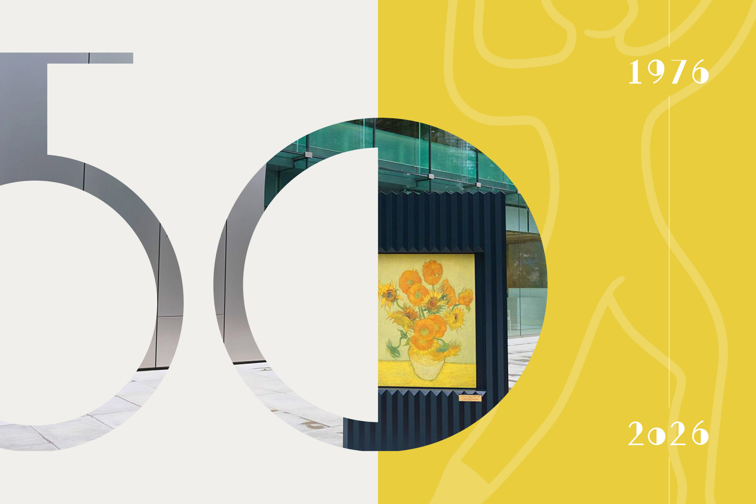
The eight logos drew on diverse themes. Some were inspired by Van Gogh’s work owned by the museum, some by the museum building’s facade, and some by the Shinjuku cityscape. Others focused on the number 50.
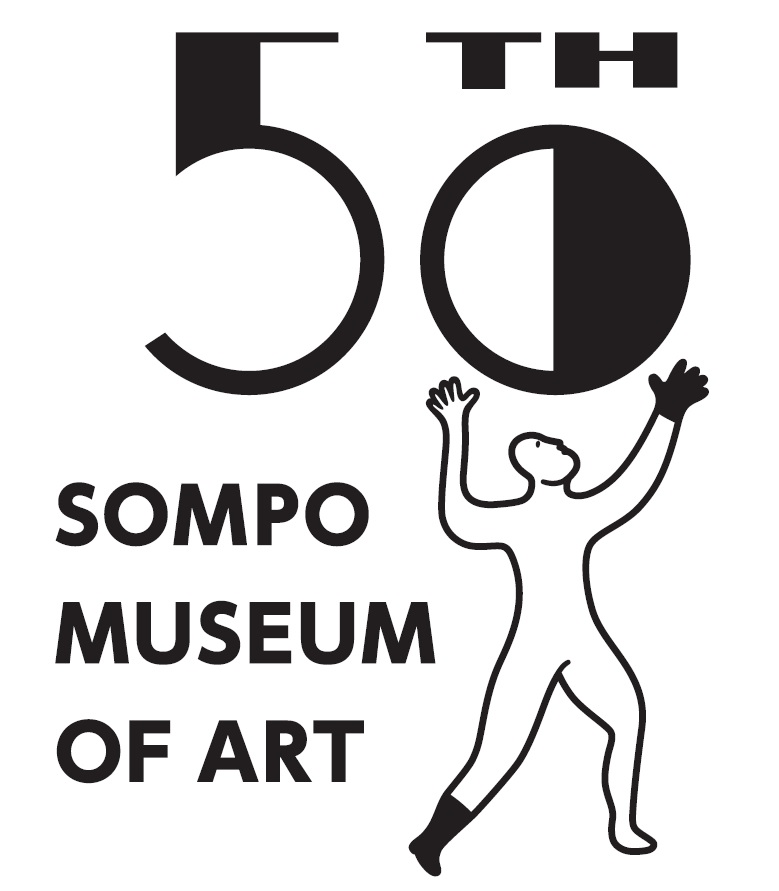
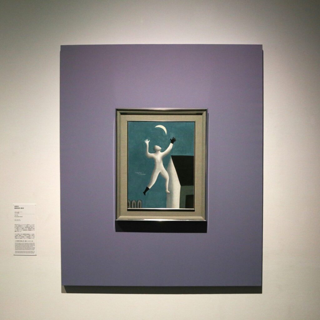
After extensive discussion among the museum’s stakeholders, a design based on painter Seiji Togo’s “Surrealistic Stroll” was selected. This was profoundly fitting, as it was Seiji Togo and his work that inspired the museum’s founding. The logo selection process, I was told, helped everyone rediscover an unchanging sentiment: that Seiji Togo is the museum’s touchstone. I heartily agree.
A hidden story behind the number 50
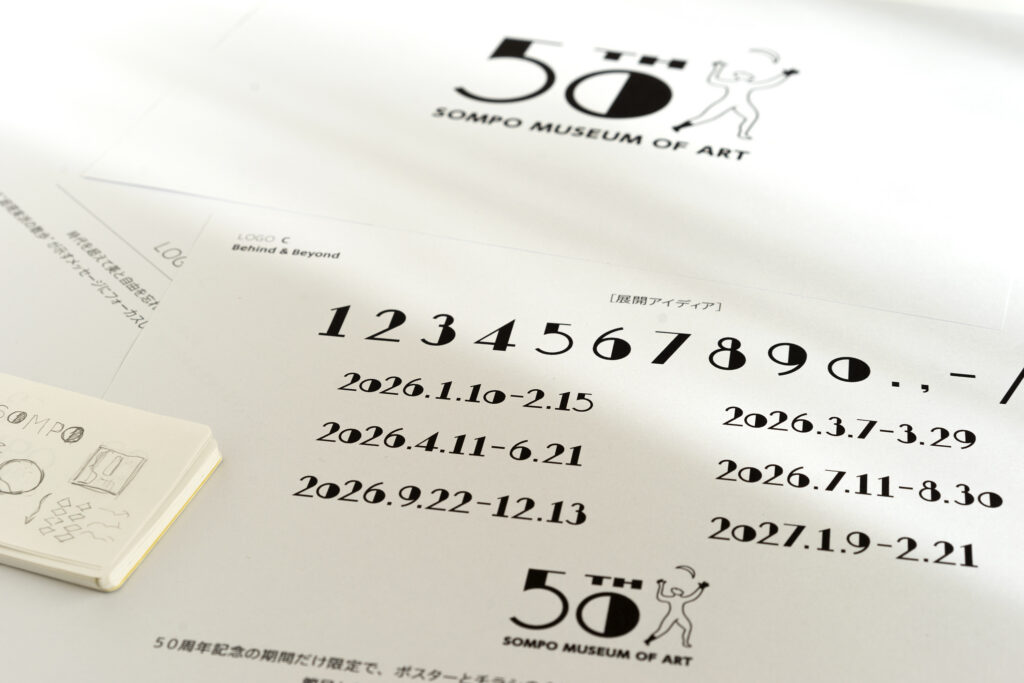
It took more than a year from the start of my commission to develop the logo till its completion. There were countless details that we focused on, and one example is the original font created for numerals 0 to 9, used for the number 50 incorporated into the logo. Most significantly, the logo reinterprets, in contemporary fashion, the art deco style of Togo’s era.
We have woven together these countless details with deep meaning. In reality, the logo’s simple look is an intricate combination of various elements, designed to be interpreted differently depending on who is looking.
Grafting the future onto history
Never have I devoted so much time to “learning” in preparation for a project. By delving into the Sompo Museum of Art’s 50 year history, the changes society and the city underwent, and the evolution of art, I eventually had a design that spoke to the past and the future. The process was one of discovery and rediscovery, a rare experience that made me value “learning” and the joy of being able to create something out of that knowledge.
I would describe the feeling I had when designing this logo as similar to grafting trees. I sought to understand the trunk of the museum’s 50 year history and graft onto it branches of the future. I saw this anniversary not as a mere milestone but as a new beginning, a fresh start.
As its designer, nothing would make me happier than to have the anniversary logo spark spontaneous conversations among visitors and those who welcome them to the museum. My hope is that the logo reaffirms where we are today and inspires thoughts of what is needed for tomorrow. Hopefully, too, its meaning steadily spreads with ever-larger ripples across Shinjuku and, over time, throughout society.